Super Control
Client-facing
Autonomous Trcuk
Dashboard
Multi-Screen
Empowering dispatchers in providing remote assistance for autonomous trucks

My Role

Team Lead & Designer

Duration

4 months, Sep. 2021 - Dec. 2022

Team Member

Charmaine Qiu (Collaborative Designer), Chukwumaobim Nnaeto (Collaborative Designer)

Advisor

Wayne Chung, Chryssa Hunlock, Klara Oberhollenzer, Milena Boytchef, Jay Penev

PROJECT OVERVIEW
Daimler Truck North America is a leading company in autonomous truck. They challenged the students on the course, Tools for UX Design, to design a mission control system that supports future truck dispatchers to provide remote assistance for autonomous trucks.

As the team lead and designer of the team, I guided the team throughout the process of background research, conducting interviews, developing research models, ideation, and iterations.

Our Project Timeline

DESIGN GOAL
Help Truck Dispatchers Step into a Better Future
Autonomous truck is future. However, there are still situations that require human support during the process, such as task assignment, system monitoring, remote assistance, and departure & arrival clearance. Super Control is an all-in-one platform that includes dispatching system, monitoring system, and remote control system in order to support dispatchers to conduct complex tasks with efficiency.
CLIENT FEEDBACK
Invited to present to their internal teams
After presenting to Daimler North America team, we received positive feedback for the practicability of our design and the visual execution.
Background
The Trucking Industry is an essential part of the US and global economy. Currently, 94% traffic accidents are caused by human factors, such as driver fatigue. More than 50% of trucks are not utilized on the road. Moreover, there will be more than 167% of drivers shortage in the labor market in 2028 than in 2018. Autonomous truck is the key solution to address these challenges by requiring fewer human drivers’ operations, increasing efficiency in route planning, and promoting digitalization in the logistics sector. However, autonomous trucks cannot cut humans out of the loop. It requires dispatchers to not only assign virtual drivers but also supervising trucks in motion.
CHALLENGE
How Might We provide Integrated and Efficient strategies for Dispatchers to provide Remote Assistance to autonomous trucks?
Highlighted Experiences
Dispatching Orders & Departure Clearance
  • Nudge users to take action via notifications about new-coming orders
  • Visualize truck parameters to facilitate dispatchers' decision-making
Truck Monitoring
  • Quickly locate trucks with a multi-dimension filter
  • Inform dispatchers with concrete road conditions through live cameras
Remote Assistance
  • Report dangers with salient visual changes
  • Provide users with step-by-step guidance based on the context
  • Ease communication with different stakeholders in an all-in-one chat window
Remote Restart
  • Guide users to restart smoothly through an instructional checklist
Research
SUMMARY
Considering both the Users and their Context
Our primary users are truck dispatchers. From our stakeholder map, truck dispatchers are within a huge system and required to interact with different parties to successfully manage trucks.
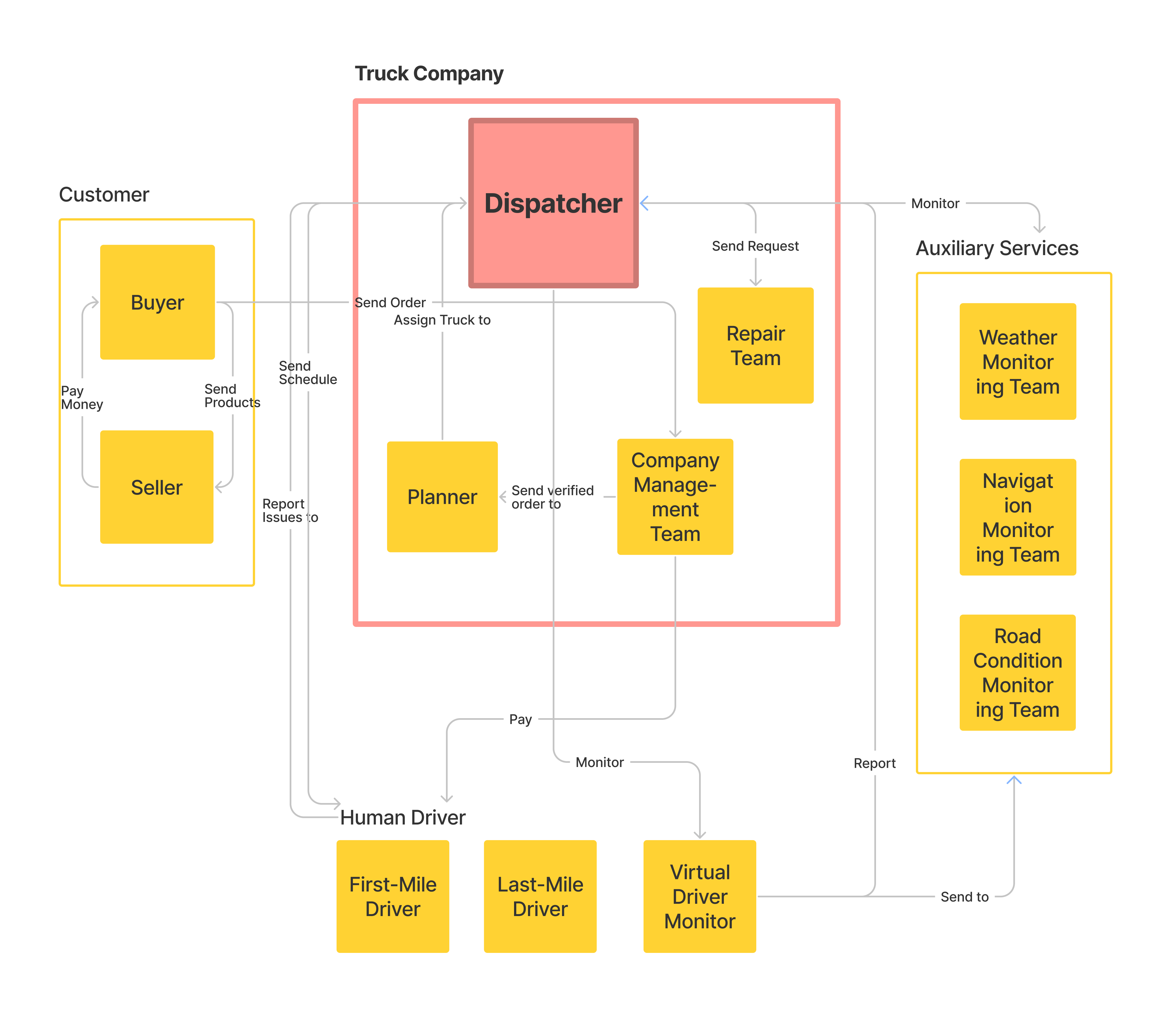
Therefore, we conducted research from two angles: Understand the User & Understand the Context.
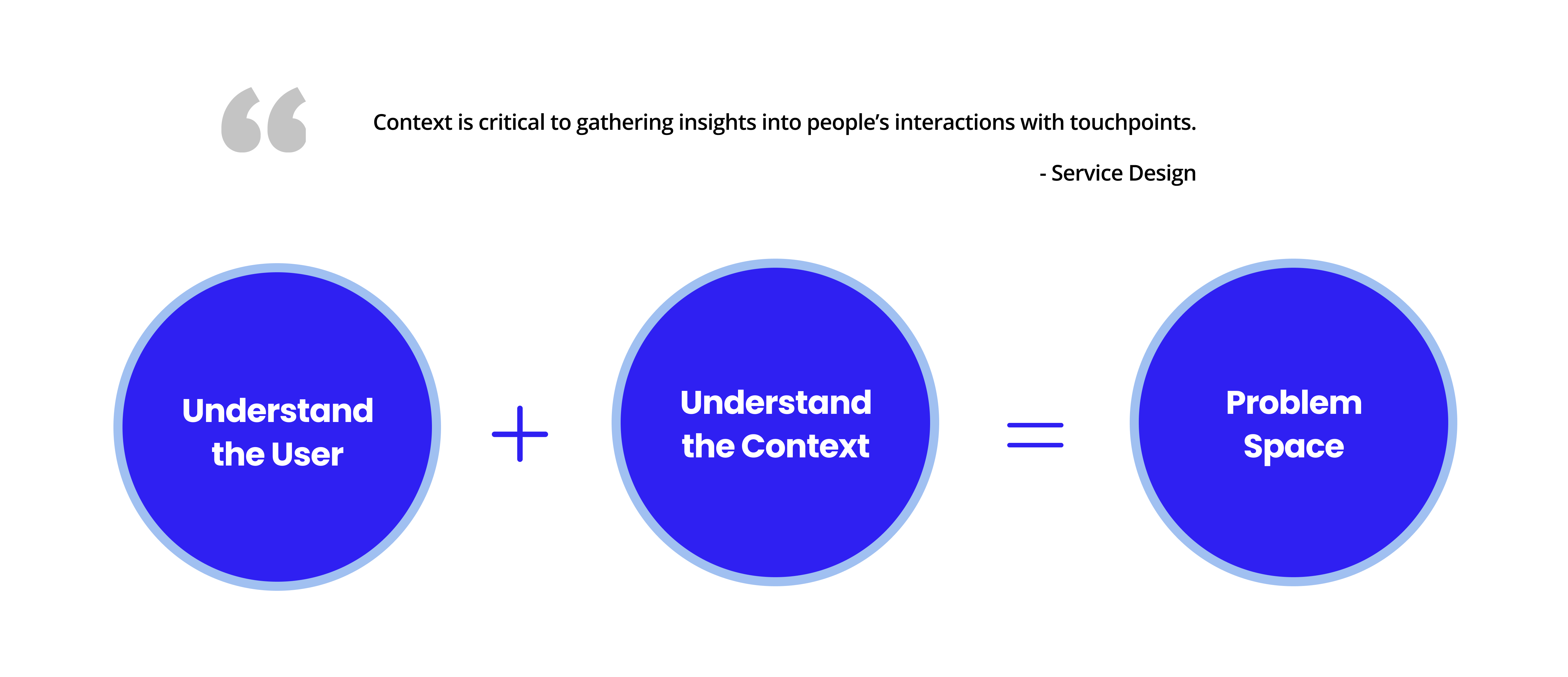
UNDERSTAND THE USERS
Collecting data from multiple resources
Instead of collecting all data from scratch, we inherited some data from the Daimler team to picture the lives of dispatchers and understand their needs.
2
Contextual Inquiries
using direct storytelling with current dispatchers who work
in Daimler
2
Interviews
with a Daimler administrator and an autonomous vehicle expert
9
Diary Studies
on the diaries and work logs of 9 dispatchers over a week
6
Survey Studies
from 242 participants, which include the drivers, dispatchers, and planners
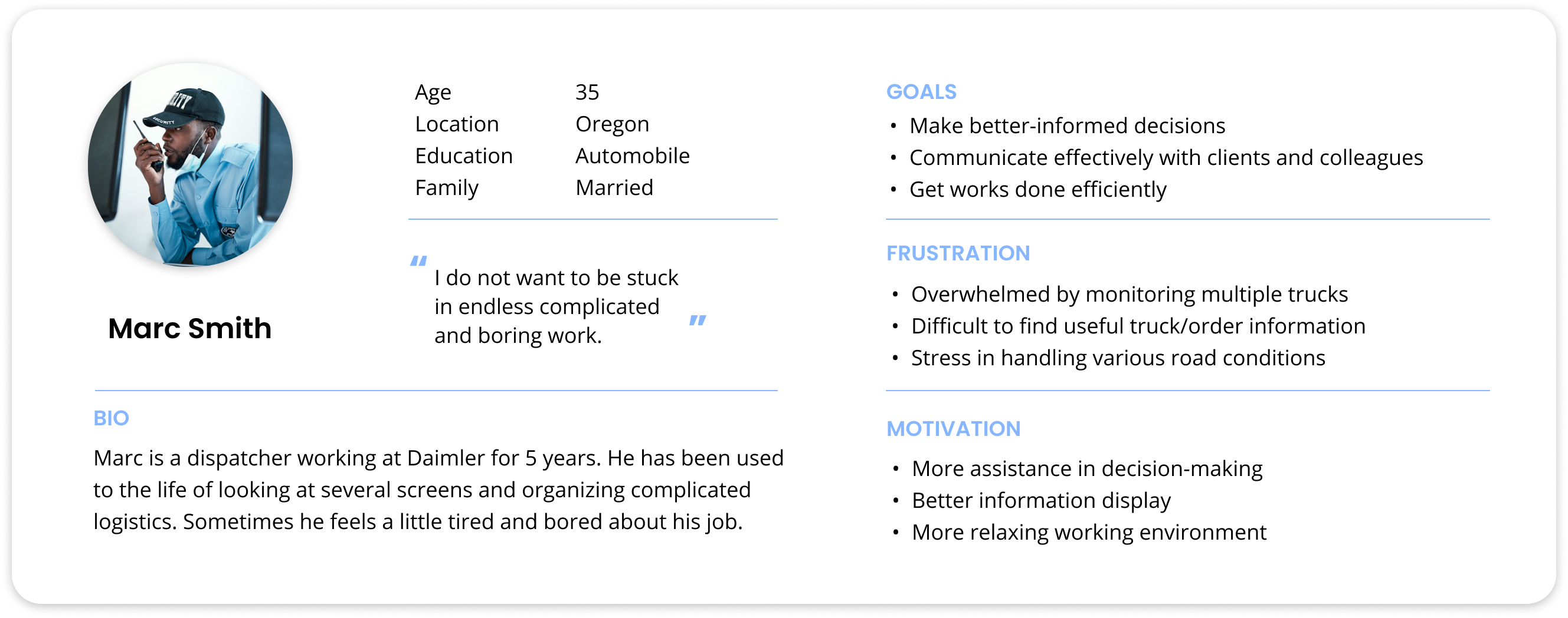
Who are dispatchers?
We fleshed out the dispatcher persona to help us empathize with dispatchers‘ great pressure from their long daily work time.
What challenges are dispatchers facing?
Our collected data presented us dispatchers’ daily life. By using an affinity diagram, we further gained the insights into dispatchers’ needs for the mission control system.
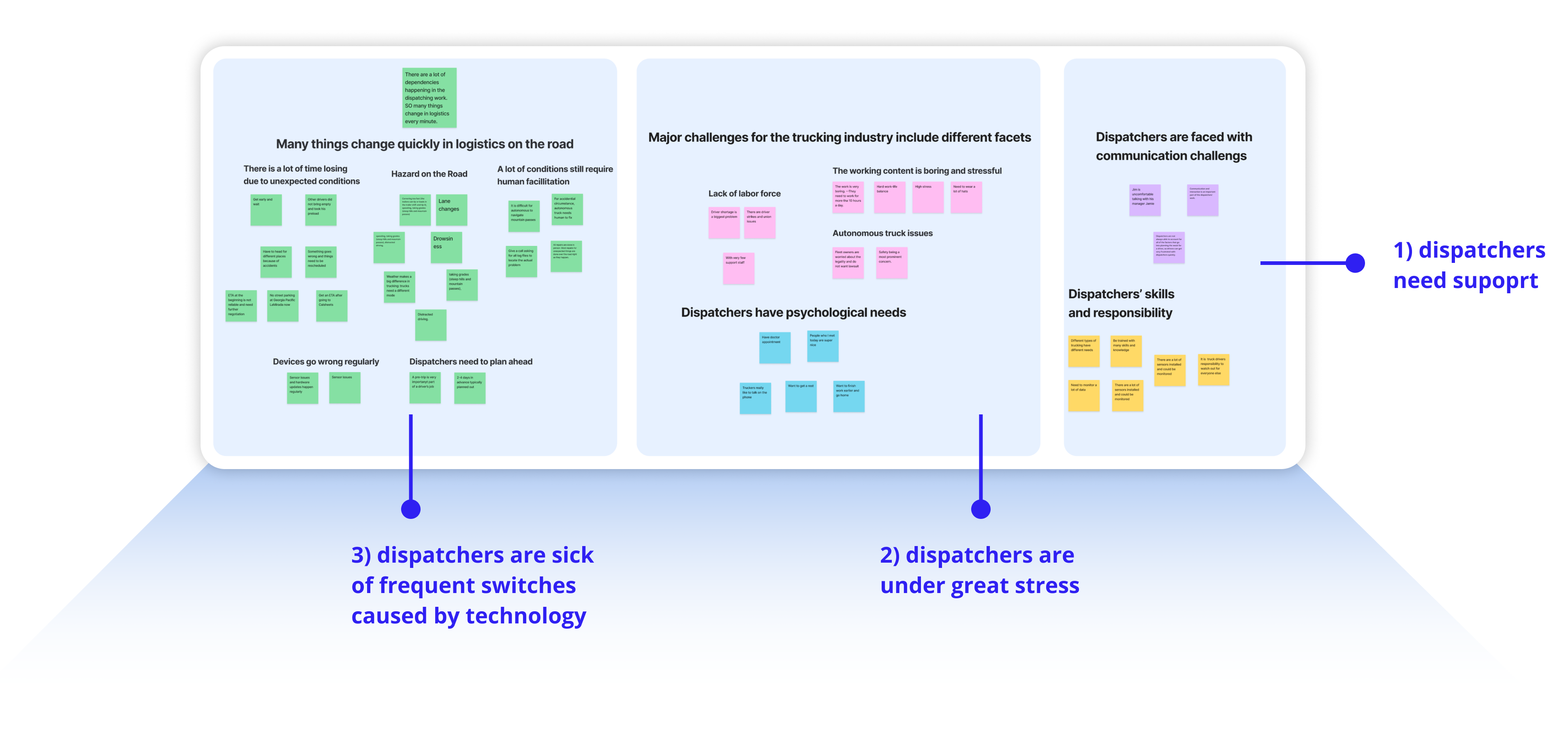
Frustration 01
Lack of Support
Dispatchers do not necessarily have truck-driving experience. They need support when facing heterogeneous road conditions.
Frustration 02
Sick of Noisy Technology
Dispatchers need to operate many different systems, which makes them sick of noisy technology.
Frustration 03
Great Stress
Dispatchers are under great stress. They need top deal with many logistics and cannot achieve a good work-life balance.
UNDERSTAND THE CONTEXT
Workflow of Dispatching Autonomous Trucks
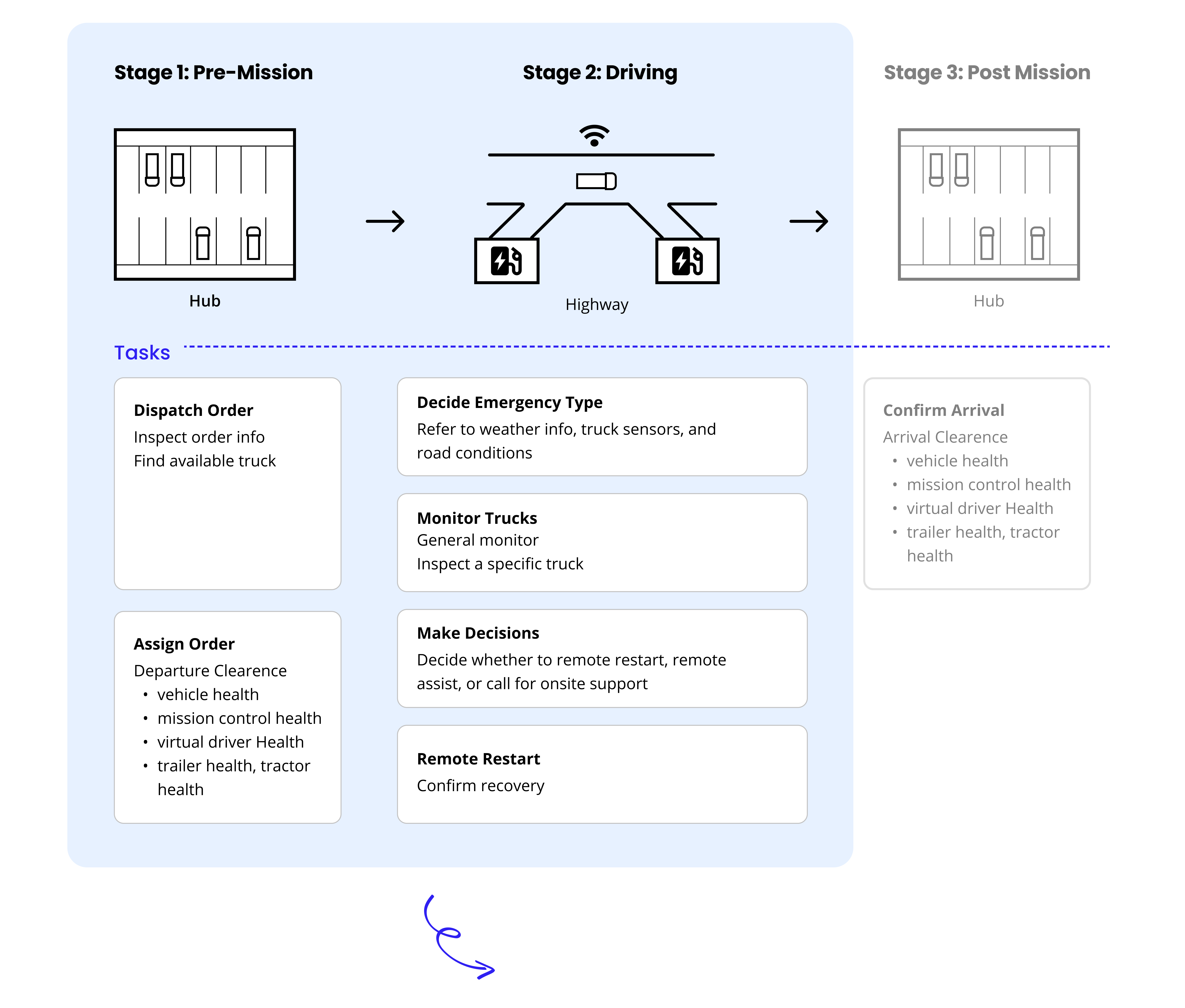
Under Hub2Hub strategy, dispatchers are in charge of assigning orders to virtual drivers available in the hubs and supervising the entire autonomous mission process. We mapped out dispatchers’ workflow to guide our end-to-end design. Our design addressed the challenges that dispatchers will face in their tasks at Stage 1 and Stage 2. The arrival clearance task at Stage 3 is similar to the departure clearance task at Stage1, therefore sharing the same design essence.
Painpoint 01
Dense Transfer Work
Dispatchers need to follow the progress of various issues and ensure these issues are resolved. Every issue requires a lot of coordination between different stakeholders.
Painpoint 02
Complex Situation
Dispatchers have to make decisions within seconds when emergency comes, while the condition could be very complex.
Painpoint 03
Low Efficiency
Dispatchers need to monitor tons of information and make matching among them.
OPPORTUNITIES
HMW innovate the truck dispatching system with Autonomous Truck Mission Control?
The key is to provide support for dispatchers and increase system efficiency.
Implication 01
Empower dispatchers with actionable support to inform decision making
Implication 02
Increase system efficiency by managing users' cognitive load
Implication 03
Build an all-in-one system to avoid technology distraction
Design Process
IDEATION
Drag Thoughts from Existing Systems
While there are not many competitive products available in the market that have the entire mission control system, we looked into the designs that partially contain our envisioned mission control. These products, such as dispatching systems, flight schedule systems, schedule-managing systems, remote navigation systems, and device monitor systems, helped us to generate ideas on the structure and key elements of our targeted mission control system.
Mechanism 01
Multiple screens with interlinked tasks to improve dispatchers' focus
Mechanism 02
System pre-visualize data to speed up dispatchers’ daily logistics
Mechanism 03
Step-by-Step guidance under emergency to support decision-making
DESIGN IDEATION #1
Low-fi Iterations on Information Architecture
Combining with our research on autonomous truck, we started from laying out all information that needs to be displayed. With the static display at hand, we moved on to finalize the information architecture.
Key Problems 1

HMW Match Related Information on Different Screens?

  • Information on different screens is overlapped, which caused users’ confusion
  • While orders are the main focus for dispatchers, information in this area is not enough
  • Distinguished the functions of each screen
  • Added necessary entries in the information center
Key Problems 2

HMW Match Reduce Unnecessary Information?

  • Provide too much information which is insignificant, which causes a lot of visual noise (i.e, users cannot make sense of looking at a lot of maps)
  • Users cannot be directed to a specific target easily
  • Got rid of insignificant information- Organized into “Dispatch View” and “Monitor View” to facilitate dispatchers under different scenarios
  • Included a filter system to help dispatchers quickly locate and find their targets
Key Problems 3

HMW Increase the continuity of the display and demonstrate the purpose of each screen?

  • Monitor view is the last area to be noticed with this layout (as users usually look from left to right)
  • Not enough truck performing indicators
  • Reorganized system layout to highlight the monitor view and help dispatchers focus
  • Added more required performing indicators to visualize necessary parameters
DESIGN IDEATION #2
Mid-fi Iterations On End-to-End User Flow
According to the previous workflow, we concluded that there are 3 major stages for dispatchers' work: Pre-Mission, On the Road and Post-Mission. And our main focus is Pre-Mission and On the Road.
Key Problems 1

HMW support dispatchers when they are assigning orders?

  • Redundant and useless filter that fails to help dispatchers locate trucks
  • Lack of support for departure clearance
  • Redefined filter categories according to message sent from planner with customizable options
  • Added an explicit checklist to scaffold dispatchers smoothly finish departure clearance
Key Problems 2

HMW inform users about the functions they could employ to monitor trucks?

  • Users are confused about whether the camera view is live or not
  • Users do not know know they could switch between 3 views and complains that the other 2 views are too small
  • Added salient icons to indicate state and action for different views
Key Problems 3

HMW inform users about the functions they could employ to monitor trucks?

  • Users feel confused when the guidance appears under different place
  • Emergent stop function being inaccessible
  • Constraint the guidance in a specific area to avoid adding cognitive load for dispatchers
  • Highlighted emergency stop button
CRAFTING THE DESIGN
Execute on the High-fidelity Prototypes
Since dispatchers are looking at the screens all day long during their work, and the system they currently use during their work is dark system, we decided to use dark mode as the default visual style.
We referred to the Dark Mode Guideline of Microsoft and  we developed the design system to clean up our design. We also decided to unify the components with a sharp corner. Check out the entire design system at the bottom.
A desktop software of multiple screens that work coordinately with each other.
Screen1: Information Center
This interface serves as an information center. Aside from providing dispatchers with easy access to all order information, other necessary information like notification, communication and mission control health are displayed to facilitate dispatchers’ work.
Screen2: Action Center
As the action center for dispatching and monitoring, this interface provides dispatchers with convenient searching and filtering functions to help them locate their targets efficiently. The easy shift between two viewports empowers dispatchers with their needed visualization to suit their works under different scenarios.
Screen3: Remote Assistance Center
Detailed info for selected trucks to empower dispatchers with needed contextual info, to support them make decisions.This interface plays a key role in remote assistance. With detailed indicators of the individual truck, rich contextual info and step-by-step guidance, dispatchers are able to make decisions quickly and effectively.
Key Takeaways
Design future based on now
When we were challenged with designing a future system, I found it difficult to envision how it would be like at the beginning as there are not any existed cases. This is not only a product from 0-1, but more of a new system from 0-1. During the process of user research, the A-ha moment stroke me when I realized that while we were designing future, we were still designing for the same group of people. Shortly, I shifted my mindset from "designing a future system" towards "helping dispatchers better step into future". With this passion, our team kept going back to Daimler team with our design and iterate according to their feedback. While none of us was sure about how future autonomous truck industry would look like, we were together shaping it for better lives.
Multi-screen design: The spatial relationship counts
To cater to dispatchers' context of using multiple screens, we took the challenge of designing a control system across multiple screens. During the process, we experienced a lot of frustration caused by the lack of consistency and cohesion in between different screens when conducting pilot tests. After talking with subject-matter experts, we figured out the importance of considering the screens as a whole. Instead of seeing them as different screens, we considered them each as a part of a wide screen. With this thought, our information on our dashboard started to flow across the system.
<   Previous : Music DropNext : Captain DICK's >
HomeProjectsSocial Fitness ServiceAI MicrowaveConvAI Health ChatbotSkeema Tab ManagerReading BuddyYelp Data AppMusic DropSuperControlCaptain DICK'sAboutPlayground